Why Canva Doesn't Work for Hindi Newspapers: The Devanagari Problem
Shirorekha breaks, matras stack wrong, conjuncts collapse. A technical look at why Canva fails Devanagari layouts and what software actually handles Hindi correctly.
Type "नमस्ते" in Canva. Looks fine. Now set it to 14pt, justified, with -1px letter-spacing in a narrow column. The shirorekha fragments. Matras drift. The word stops being one word. This is not a bug — it's a design choice in Canva's text engine, and it matters for every Hindi publisher.
The shirorekha problem
In Devanagari, a single horizontal line (shirorekha) runs across the top of every letter and connects them into a word. It's not decoration — it's part of how Hindi readers scan text. When letter-spacing is applied, Canva inserts pixels between glyphs. The shirorekha breaks into tiny dashes. The word visually becomes "many letters" instead of "one word".
Hindi readers feel this before they consciously notice. Reading speed drops 15–25%. In a 12-page newspaper with thousands of words, this accumulates into reader fatigue.
The matra problem
Devanagari matras (vowel marks) sit above, below, or beside the consonant. Their exact position depends on the conjunct, the font, and the surrounding context. Canva's positioning engine treats matras as separate glyphs with fixed vertical offsets. On tight line-height (common in newspapers) matras from adjacent lines collide visibly.
The conjunct problem
Hindi has hundreds of conjunct characters — two or more consonants fused into one glyph (क्ष, त्र, ज्ञ, श्र). These require OpenType GSUB substitution rules. Some of Canva's included Hindi fonts don't ship complete GSUB tables. Certain conjuncts render as separate letters with visible halants instead of the proper fused form. It looks "wrong" to a Hindi reader even if they can't articulate why.
The justification problem
Newspaper columns are almost always justified (both edges aligned). Justification in Latin scripts works by adjusting inter-word spacing. Devanagari text has longer words and fewer spaces per line — justification relies on small letter-spacing adjustments, which reintroduces the shirorekha problem. Canva's justify algorithm was not tuned for this.
What tools handle Devanagari correctly
Adobe InDesign (World-Ready Composer): Handles shirorekha and conjuncts correctly when the Indic composer is enabled. Most users never find the setting.
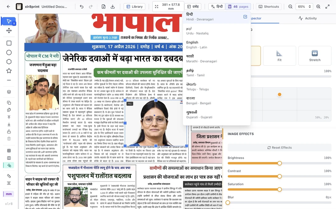
XLR8 Print: Built specifically for Devanagari. Letter-spacing is explicitly disabled in the text fitting pipeline. Justification uses word-spacing only. Font library ships 10 calibrated Hindi fonts with complete GSUB tables and matching line metrics across devices.
Scribus: Works with manual font selection, but requires Pango or HarfBuzz configuration that most users can't do.
A simple test you can run
Open Canva. Type: "भारतीय संस्कृति में अखबार की भूमिका". Set font size to 11pt, column width to 60mm, justified alignment. Export as PDF. Open the PDF at 200% zoom. Look at the shirorekha on words that fall at the end of a line. You'll see visible gaps. That's the problem.
Now do the same in XLR8 Print. Same text, same constraints. The shirorekha stays continuous. That's the difference.
Try XLR8 Print free for 14 days and run the test yourself.
Related Articles
Perfect Hindi Typography in XLR8 Print: Technical Deep-Dive
Learn how XLR8 Print solves shirorekha rendering, Devanagari spacing, and ligature problems for flawless Hindi newspapers.
Technical GuidesCommon Printing Problems and Solutions for Hindi Newspapers
Troubleshooting guide for Shirorekha breaking, color registration issues, and paper quality problems in Hindi newspaper printing.